Introduction
Last time, we dove into Louisville’s open crime data set to explore the city’s violent crime. Today, we examine the vast world of theft/larceny crimes in Louisville. In this post, I will explore in more detail the idea of crime dispersion. I would like to quantify more rigorously the idea of whether crime, specifically theft in this post, is becoming worse everywhere or whether we are only seeing a worsening in localized areas, with a stabilization (or even a decrease) throughout the rest of the region. To do this, I will borrow ideas from economics and geospatial crime analysis. Without further ado, let’s get started.
Overview of Theft Offenses
While violent crime had a very narrow scope consisting of 4 major offenses, theft offenses cover a much wider range. Depending on how we want to define it, theft could cover crimes as diverse as fraud, motor vehicle theft, bad checks, shoplifting and identity theft. The National Incidence Based Reporting System (NIBRS) classifies 8 crimes(pocket-picking, purse-snatching, shoplifting, theft from building, theft from coin-operated machine or device, theft from motor vehicle, theft of motor vehicle parts or accessories, and all other larceny) as theft/larceny offenses. The separate crimes of motor vehicle theft and stolen property offenses seem to get labeled as theft by the city of Louisville, so we will include those offenses in our analysis as well. Fraud, while obviously related to theft, is given separate treatment in the NIBRS reports and I will defer to them in this instance.
Let’s start in the same manner as last time by taking a broad view of theft over the years.
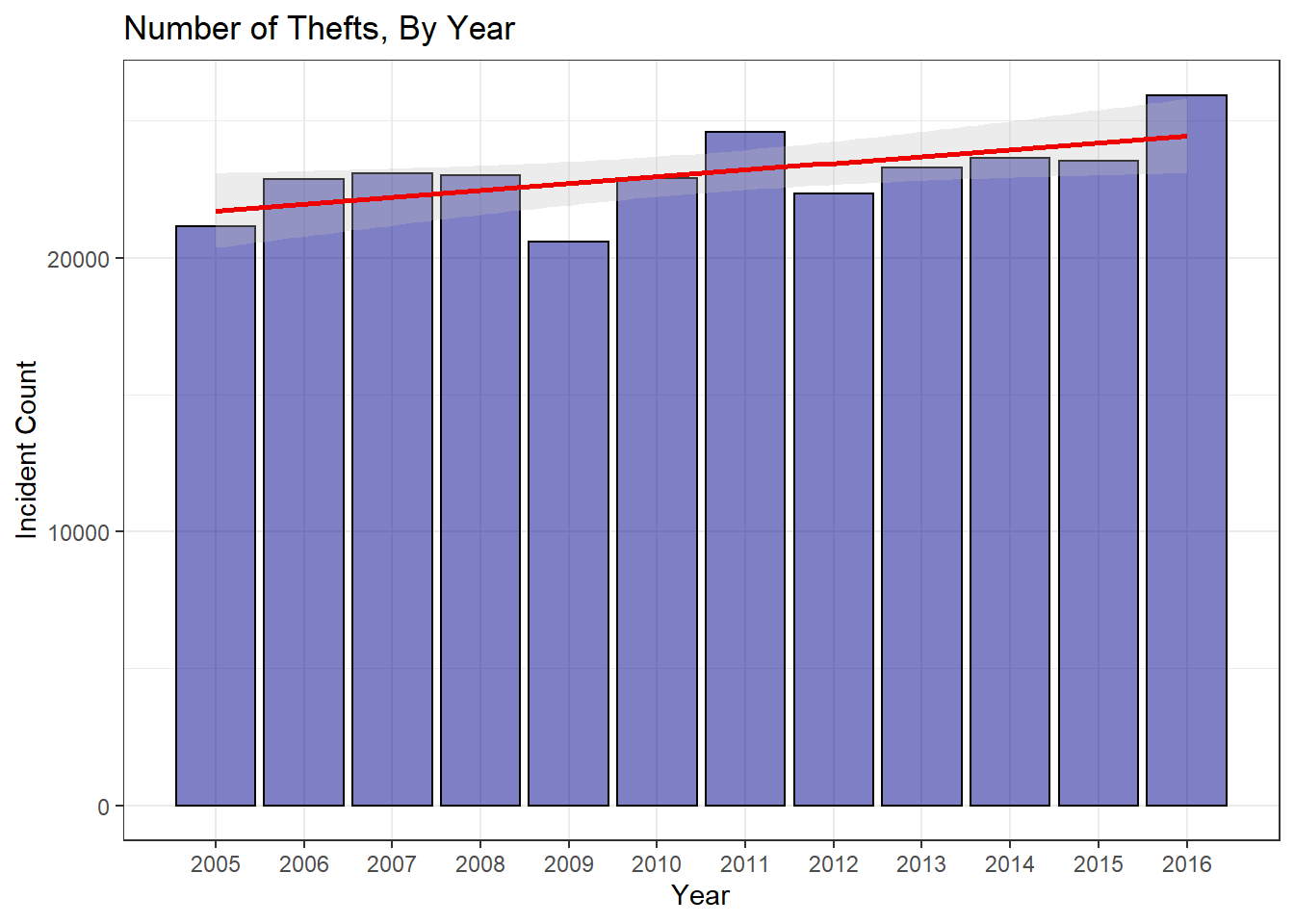
At first glance, it appears that thefts are up a modest amount. 2016 thefts are up from the 12 year mean by 12.4%. This definitely seems significant, but before jumping to conclusions, we should probably do a bit more analysis.
| crime_type | Change_from_2015 | Change_from_Max | Change_from_Mean |
|---|---|---|---|
| theft_offenses | 10.2% | 0% | 12.4% |
As usual, it is very informative to view the distribution of thefts, in this case by day,
to check for anything unusual.
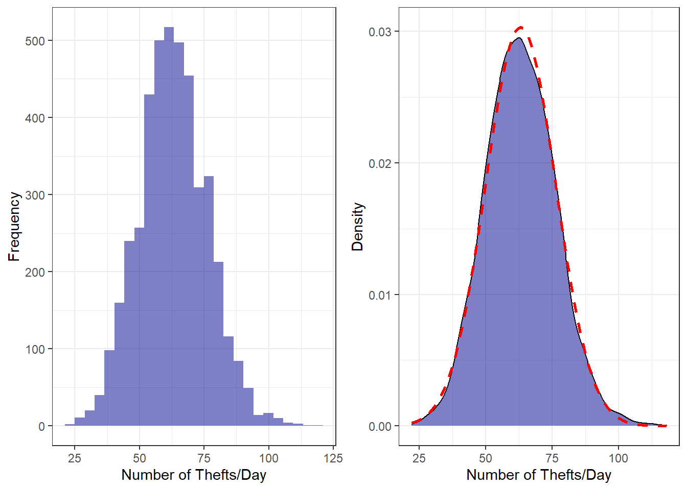
From the plots above, we can see that the data is very close to being normally distributed. There is perhaps a very(very) slight right skew with a fat tail, but it is so minor that we can treat our data as normal and gain the benefit of those assumptions in our modeling.
The distributions also give us our first sense of how prevalent thefts are with an average of
63.1 thefts per day. Looking at two specific years,
say 2010(the last available census year) and 2016, we see an increase from 62.7
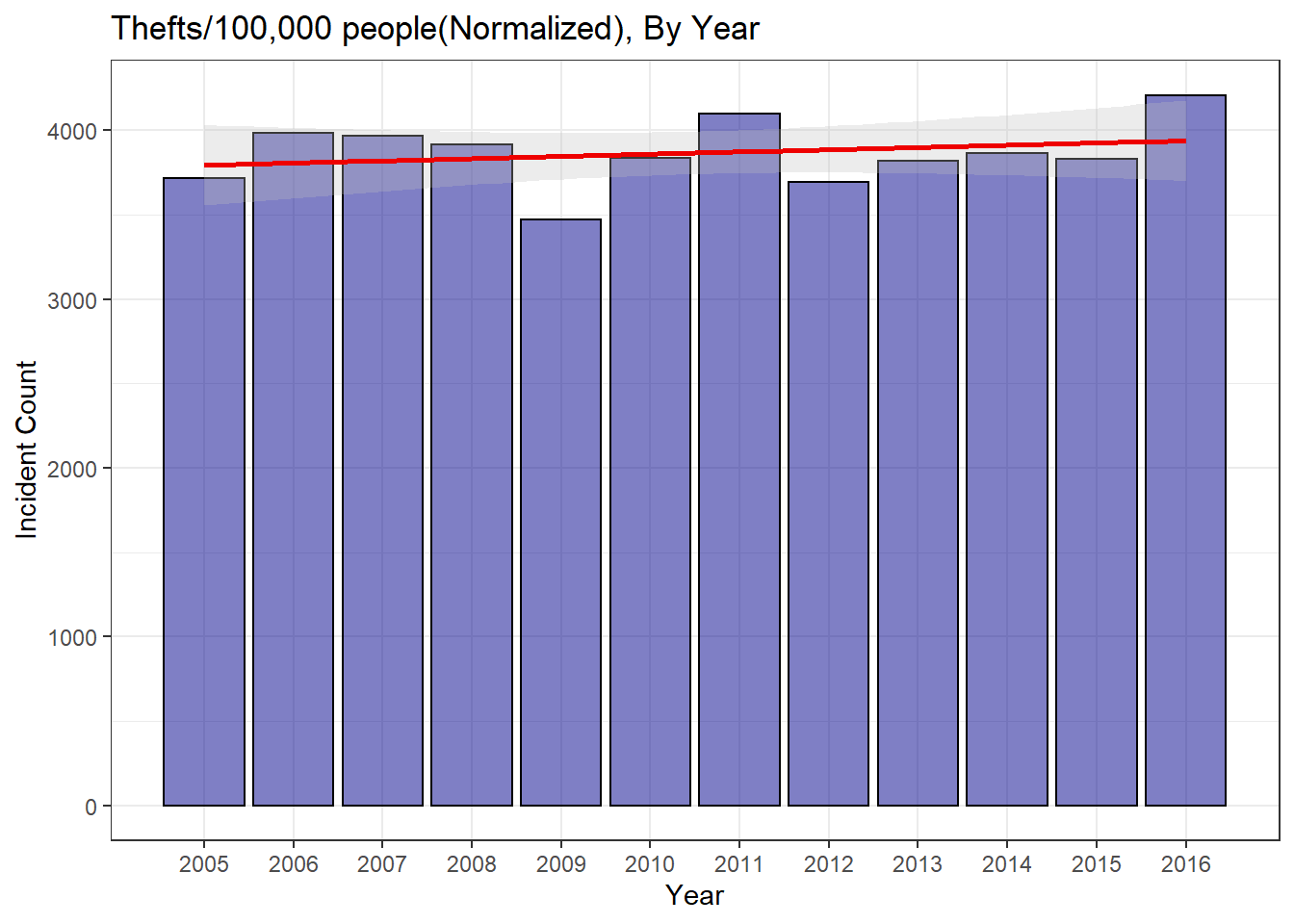
to 70.8 thefts per day. However, if we normalize for the population
increase using US census data,
and view it in more relatable units(# of thefts per 100,000 people per day), this increase seems much smaller
– 10.5 in 2010 to 11.5 in 2016.
This ignores many of the complexities inherent to normalizing data for population(e.g., at what level should
you normalize? City wide? Zip Code? City Block?) but does provide a glimpse into just how nebulous this sort
of analysis can be. In fact, when we normalize the yearly theft counts we see a plot with a significantly
flatter trend line, indicating a smaller rise in the number of thefts.
Has there been a significant change?
As you may have guessed, our decision on whether to normalize the data for population
changes will have a major influence on the question of significance. First, compare
the normalized versus the unnormalized distributions for 2016 vs 2005-2015.
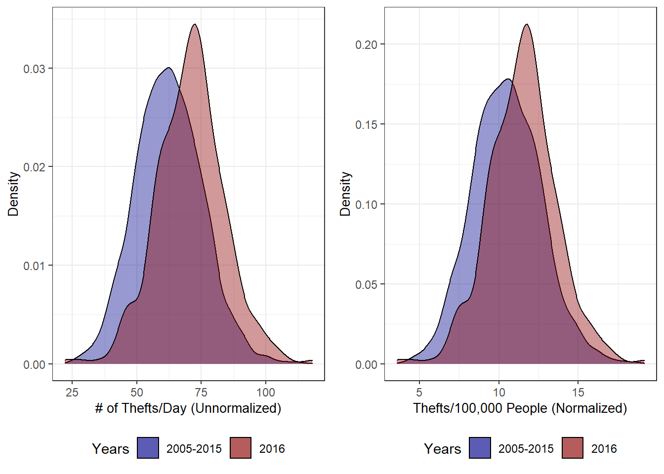
Viewing the distributions, it is pretty clear that 2016 was a unique year. Both the normalized and unnormalized distributions are right shifted from the 11 year average. The 2016 distribution is also narrower and higher peaked. These two facts seem to indicate two things– one, the number of thefts per day has increased regardless of whether or not you normalized the data and two, there are more high theft days occurring than before. The differing shape of these distributions is actually somewhat troubling for our analysis, but warrants a post of its own. For now, we are going to work with the assumption that the distributions are similar enough in shape to allow for the use of a t-test to compare means.
When we perform these t-tests, we unsurprisingly find that they indicate significant changes in the means of both the normalized and unnormalized data. Both data sets have p-values less than 2.2e-16(tiny!), meaning we reject the null hypothesis that the means are equal. When you look at the confidence intervals for both, you see the means of the 2005-2015 data both fall well under the lower bound.
##
##  One Sample t-test
##
## data:  sums_2016$count
## t = 12.39, df = 364, p-value < 2.2e-16
## alternative hypothesis: true mean is not equal to 62.41937
## 95 percent confidence interval:
##  69.49977 72.17146
## sample estimates:
## mean of x
##  70.83562
##
## One Sample t-test
##
## data: sums_2016$pop_adjusted
## t = 9.1167, df = 364, p-value < 2.2e-16
## alternative hypothesis: true mean is not equal to 10.48949
## 95 percent confidence interval:
## 11.27765 11.71118
## sample estimates:
## mean of x
## 11.49442This set of tests is only a first, rough, step, but it does give us an idea of what we are dealing with. It appears 2016 saw a significant increase in thefts over the 11 year average. After normalization for population increases, we are seeing on average about 1 more theft per day per 100,000 people. This works out to about 6 more thefts per day when normalized. However, as usual, this sort of analysis needs some perspective. As mentioned above, the shapes of the distributions differ quite a bit. T-tests rely on distributions differing only in central tendency(i.e. the mean). If this assumption is violated, then our t-tests may not be accurate. There are some additional problems with using t-tests to compare central tendency in this crime example, but they are more detail than is wanted for this post. Perhaps I will address these in a later post. For now, it is reasonable safe to conclude that thefts in 2016 were higher by a statistically significant amount.
Why all the shoplifting?
While exploring the data, I noticed that a huge portion of thefts were shoplifting. While this makes sense, it got me wondering if there has been a difference between thefts committed against individual people and those committed against businesses. While not a perfect proxy, if we look at the primary business related theft–shoplifting–verse all other thefts, we can gain some more insight.
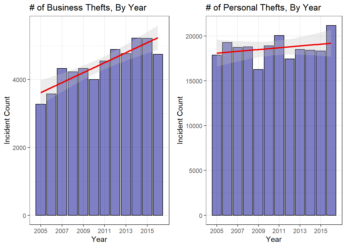
So it is obvious that business thefts are trending upward, but it is not as readily apparent with personal thefts. The trend is clearly upward, but this seems due to the large spike in 2016. So this lends evidence to the fact that thefts–especially against persons–were up in 2016. However, looking at the longer term trend it seems like a sharp rise in shoplifting could be driving a lot of the increased theft numbers. I don’t want to go too off on a tangent exploring this, but it needed to be noted. One first question I have is whether prosecution of shoplifters was changed in some way between 2005 and the present. The sharp uptick seems like something that could be explained by a change in the laws surrounding the crime. If you know anything about it, feel free to send me an email!
Mapping Theft Locations
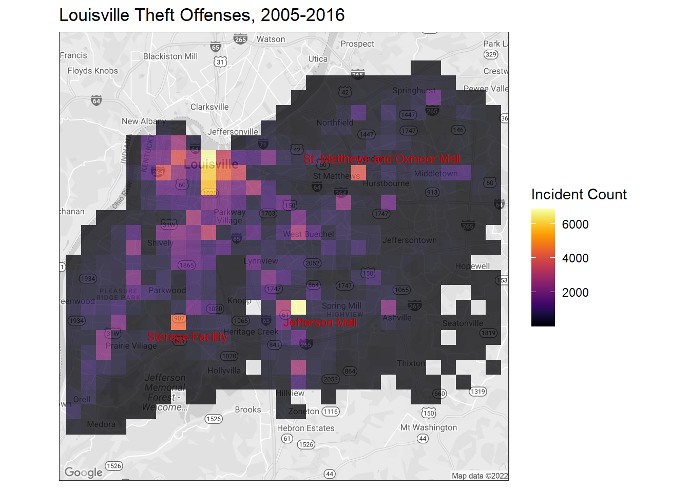
Mapping theft locations provides a good understanding of the distribution of theft throughout the city. We can immediately see that, as with violent crime, the major hot spot is centered downtown. Presumably this has something to do with the population density being higher downtown, but I will not delve into that issue today.
Instead, I want to briefly look at the dispersion throughout the city. If you look carefully at the map, you will notice that despite the obvious hotspot downtown, we still have color feathering into the far corners of the city. There are also several isolated ‘blocks’ of high activity (indicated by the yellows and orange/salmon colors) that are located well outside what I would consider downtown Louisville. Two of those–labeled in red–are locations of shopping malls which, understandably, have higher levels of shoplifting/theft. The other two areas are less obvious. After some investigation, the high count block west of Heritage Creek seems to be a high theft storage facility. The block up by Pewee Valley seems to be a result of lazy record keeping. Instead of specific block addresses for crimes in that area(zip code 40056), most of the entries were just given a ‘community at large’ address. When the geocoding was done, this resulted in thousands of identical coordinates which then spawned a high incidence count block.
Analysis of Theft Dispersal
Since our map seems to indicate a wider dispersal of thefts, looking at theft counts by
zip code should be informative.
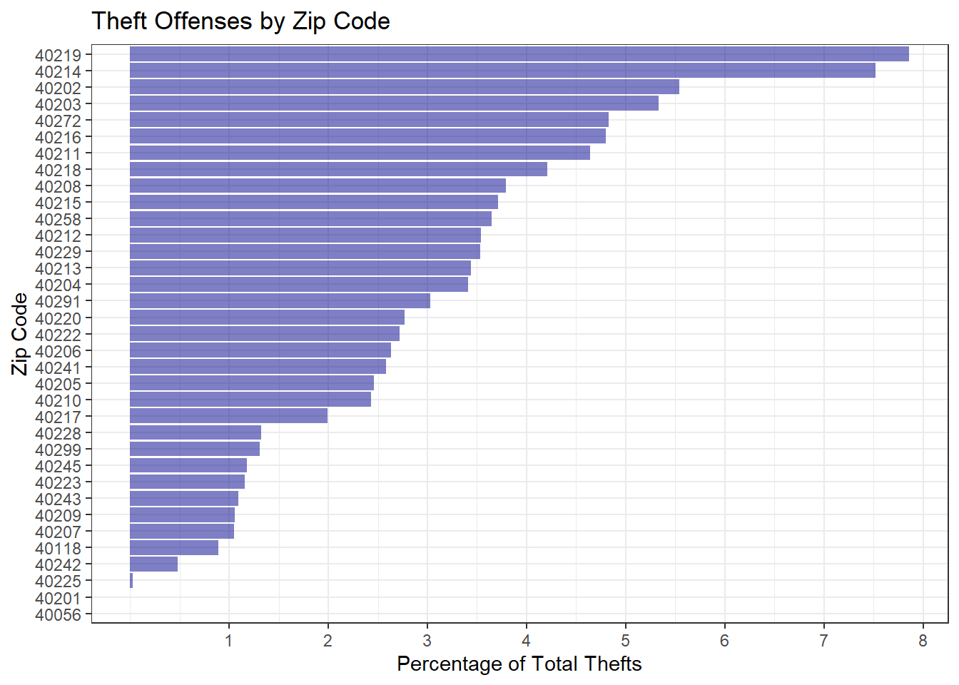
Surprisingly, the highest crime zip codes are not in downtown Louisville at all, but are more in the south and west end of Louisville. There are still several downtown zip codes– particularly 40202 and 40203 which are located at the bright yellow area of our heat map– near the top of the plot, but we can see evidence that thefts are more evenly dispersed throughout the community. While just 6 of Louisville’s 33 zip codes accounted for 48.75% of all violent crime, it takes 9 to cover 48.52% of thefts.
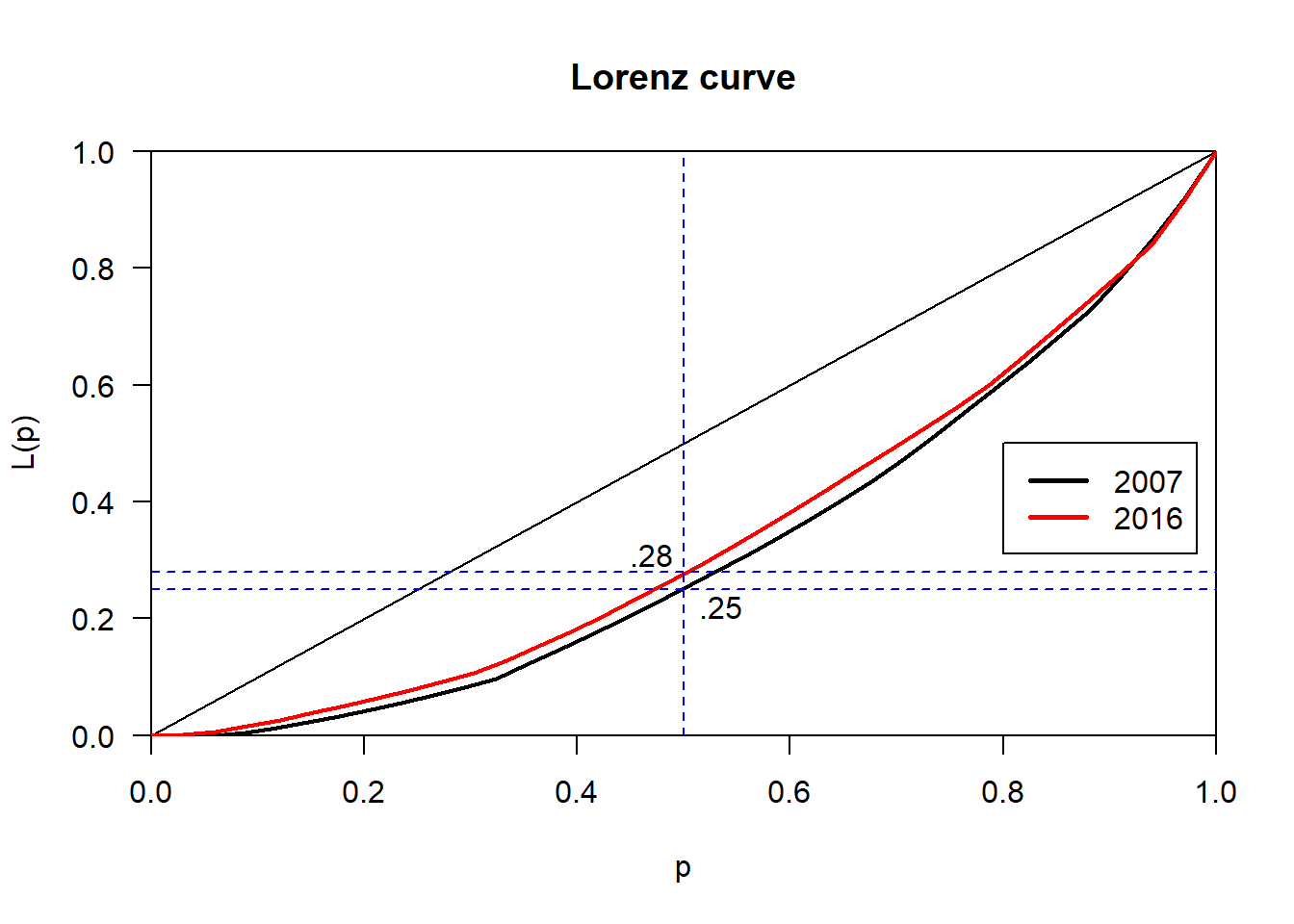
But this sort of discussion is not particularly rigorous and, frankly, is a little unsatisfying. Luckily, there are entire fields devoted to the study of dispersion. In economics, it is common to measure income related inequality using the Gini coefficient and Lorenz curve(a good introduction can be found here and here). These techniques have also been applied to identify unequal distributions in crime frequencies. For our purposes, we will measure the inequality in the frequency distribution of thefts by zip code. A Gini coefficient of 1 indicates maximum inequality(in our case this would be all of the thefts taking place in one zip code) while a coefficient of 0 indicates complete equality (thefts are evenly dispersed throughout all zip codes).
Calculating Gini coefficients for 2007 and 2016, we get 0.36 and 0.32 respectively.
This decrease indicates that theft offenses have become less unevenly distributed(i.e.,
thefts are becoming more evenly dispersed through all zip codes). We can visualize this
with a Lorenz curve. If crimes were completely evenly distributed, they would fall on the
diagonal ‘line of equality’. The further below the curved line bows, the more unequal
the data. As you can see, the 2016 curve falls slightly inside of the 2007 curve, indicating lower inequality.
So, for example, we can see that the bottom 50% of zip codes account for 28% or 25% of the
thefts, depending on the year. This solidifies the idea we saw above where a fraction
of zip codes accounted for a disproportionate percentage of the total thefts.
While this measure is a good start, it is a global measure of unequal distribution when what we would like is something more localized. A more crime specific measure that is a step in this direction is called the Offense Dispersion Index(ODI). When looking at the crime increase between two years, we first calculate the difference in each area—in our case between zip codes. Then, we order these differences from highest to lowest change. Finally, we remove the highest ranking area and recalculate the crime rate with the remaining areas. Then we take the second highest ranked area and remove it, again recalculating, but for the n-2 areas. This continues until only one area is left.
From this procedure we can calculate the ODI, which is just the proportion of areas that must be removed from the calculation before the increase in crime turns into no-change or a decrease in crime. So as you can see in the table below, it takes the removal of 14 zip codes worth of data to change the increase in crime rate from 2007 to 2016 into a decrease. So the ODI is just 14 divided by the total number of zip codes, 33, or 0.42. ODI’s range from 0 to 1 with values close to zero indicating a low crime increase dispersion factor. In other words, a value closer to 1 suggests suggests a problem across all areas, rather than something very localized. To compare, I calculated the ODI for drug crimes in Louisville to be 1. Since drug crimes were at nearly an all time high in 2007, we actually have an immediate decrease in crime with the first zip code. This suggests that, relative to drug crimes, theft remains relatively localized. Alarmingly, drug crimes appear to be widely dispersed throughout the community.
| zip_code | thefts_2007 | thefts_2016 | change_after_zip_removal |
|---|---|---|---|
| all | 23074 | 25940 | 12.42 |
| 40219 | 21225 | 23701 | 11.67 |
| 40214 | 19648 | 21805 | 10.98 |
| 40229 | 19056 | 20929 | 9.83 |
| 40272 | 17992 | 19600 | 8.94 |
| 40216 | 17022 | 18380 | 7.98 |
| zip_code | drug_crimes_2007 | drug_crimes_2016 | change_after_zip_removal |
|---|---|---|---|
| all | 15042 | 13601 | -9.58 |
| 40211 | 14155 | 12291 | -13.17 |
| 40202 | 13573 | 11423 | -15.84 |
| 40212 | 12711 | 10453 | -17.76 |
| 40204 | 12370 | 10036 | -18.87 |
| 40229 | 12201 | 9804 | -19.65 |
One additional measure worth mentioning is the non-contributory dispersion index(NCDI). The NCDI is the proportion of areas that showed crime increases divided by the total number of areas. Unlike the ODI ratio–which only uses areas that contributed to the overall crime increase–the NCDI looks at all areas that showed increases and can thus be used to show the spread of areas showing increases. For our theft and drug data, we see 0.82 and 0.36 NCDI ratios, respectively. The high NCDI on theft crimes indicates an increase in theft crimes in many areas. When combined with a mid-range ODI it seems that while theft is still relatively localized, it appears to be spreading to new areas. On the other hand, the lower NCDI of drug crimes combined with the extremely high ODI probably means that drugs are so evenly dispersed throughout the area already that further increases in these high drug crime areas are unlikely.
It must be noted that both ODI and NCDI measures are first, rudimentary, steps into quantifying crime dispersion. Much more advanced techniques which take full advantage of spatial analysis can provide significantly more detail on localized variation in crime patterns. These are far beyond the scope of this post, but with a little more work the ODI measures we calculated here can be combined with other techniques for more specific analysis. If you are interested, a good starting point is located here. This whitepaper was the inspiration behind much of this analysis and a full acknowledgement of the use of its ideas is essential.
Conclusion
This first look into theft in Louisville does provide evidence for reasoned concern. While theft doesn’t appear to be shooting through the roof, there has been a noticeable increase this past year that is not strictly localized. While most theft does take place in certain areas, these areas are not static and there is at least some evidence that these areas are expanding to new parts of the city.
However, a small fraction of the city still bears the burden of the vast majority of thefts. On the one hand, this could be an effect of enforcement policies. It seems entirely possible that, especially given the tightening metropolitan budgets, instead of policing within hotspot regions it is easier to police the zone around them in an attempt to quarantine crime to these small regions. This could potentially be more cost effective for the city. But, as we saw in the initial look at the dispersion of thefts, it is dubious that this policy is working if it is in fact being used.
On the other hand, it could be that patrols do police these areas frequently, but there are tangible demographic, infrastructure and economic factors over represented in these regions that drive up crime. For instance, an interesting next step could be to look at the spatial correlation between theft crime and drug crime to see if, perhaps, drug addiction is driving up thefts. If this is the case, then, unfortunately, the fix is more difficult than something simple like increasing police presence in the area.
Till next time!