A goal of mine in the new year is to take part in tidytuesday as often as I can. It’s a great, supportive community and I think it’s important to deliberately practice your data skills to keep them sharp. So I’m going to try to produce some sort of tidy tuesday content quite often and then tweet it out or, on more involved weeks, do a blog post about the process.
This weeks data set is Australian weather and fire data. If you’ve kept up with the news you know how devastated they have been by enormous wildfires this year. There’s already been a ton of fire visualizations making the rounds and, frankly, with my mapping skills I don’t think I can add anything useful to the pool. Instead, I want to try out gganimate for the first time and see how to make a simple, animated graph.
Data and Package Load
library(tidyverse)
library(gganimate)

theme_set(theme_minimal())

rainfall <- readr::read_csv('https://raw.githubusercontent.com/rfordatascience/tidytuesday/master/data/2020/2020-01-07/rainfall.csv')%>%
  mutate(date = as.Date(paste0(year,"-", month, "-", day)))
temperature <- readr::read_csv('https://raw.githubusercontent.com/rfordatascience/tidytuesday/master/data/2020/2020-01-07/temperature.csv')
What’s the yearly rainfall in Australia?
I’ve seen these sort of growing line graphs before, but I wasn’t sure how to make them. Turns out it’s not bad with gganimate. First, I group and summarize the data to get the yearly rainfall for each of the 6 cities in the data set. Then I build a graph of my design. The gganimate bit comes next. Since I have a time dimension–year–I need to use transition_reveal to gradually allow the data to, cough, reveal itself! I count along the years as they are being revealed by referencing the frame_along variable that transition_along makes available.
yearly_rainfall <- rainfall%>%
  filter(!is.na(rainfall))%>%
  select(city_name, year, rainfall)%>%
  group_by(year, city_name)%>%
  summarise(yearly_rainfall = sum(rainfall))
## `summarise()` has grouped output by 'year'. You can override using the `.groups`
## argument.cbp1 <- c("#999999", "#E69F00", "#56B4E9", "#009E73",
"#F0E442", "#0072B2", "#D55E00", "#CC79A7")
p <- yearly_rainfall%>%
filter(year >= 1919)%>%
ggplot(aes(x = year, y = yearly_rainfall, color = city_name))+
geom_line(size = .75)+
scale_color_manual(values = cbp1)+
expand_limits(x = c(1919, 2021))+
theme(legend.position = 'top',
legend.key.size = unit(10, 'mm'))+
guides(color = guide_legend(override.aes = list(size = 2),
nrow = 1))+
labs(color = "",
x = "",
y = "Yearly Rainfall(mm)")
p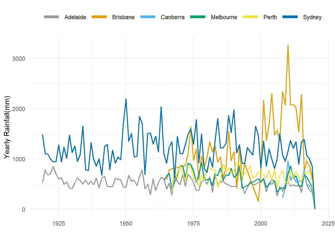
rainfall_animation <- p +
  geom_point()+
  transition_reveal(year)+
  labs(title = "How much does it rain every year in Australia?",
       subtitle = "Year: {round(frame_along)}")

animate(rainfall_animation)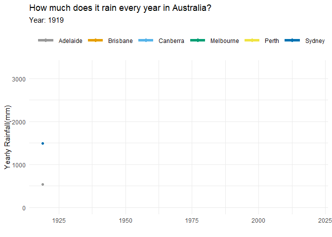
#anim_save("yearly_rainfall.gif", rainfall_animation)Pretty cool, huh?! With this graph/gif, it’s pretty easy to see which cities get more rainfall. It’s also curious that 4 of the 6 cities didn’t have data until ~ 1970. I have no idea why, but if this were a different project I’d look into why that might be.
My only other thought is about Brisbane. All the other cities are relatively stable, but Brisbane has a marked jump up around 2000. Maybe a reporting change? If you have any guesses or ideas why, feel free to send me a message!